Brand-new higher readability packaging, more accessible for everyone.
Our decision to take a step forward in the relationship between drug and patient under the banner of ‘Taking care’ in a responsible way of all aspects of accessibility to therapy: greater clarity, maximum readability and constant trust.
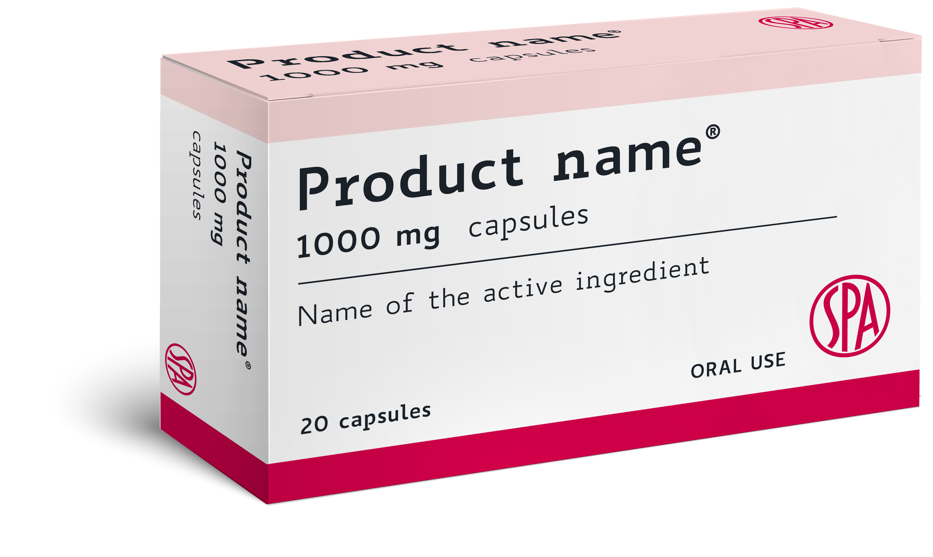
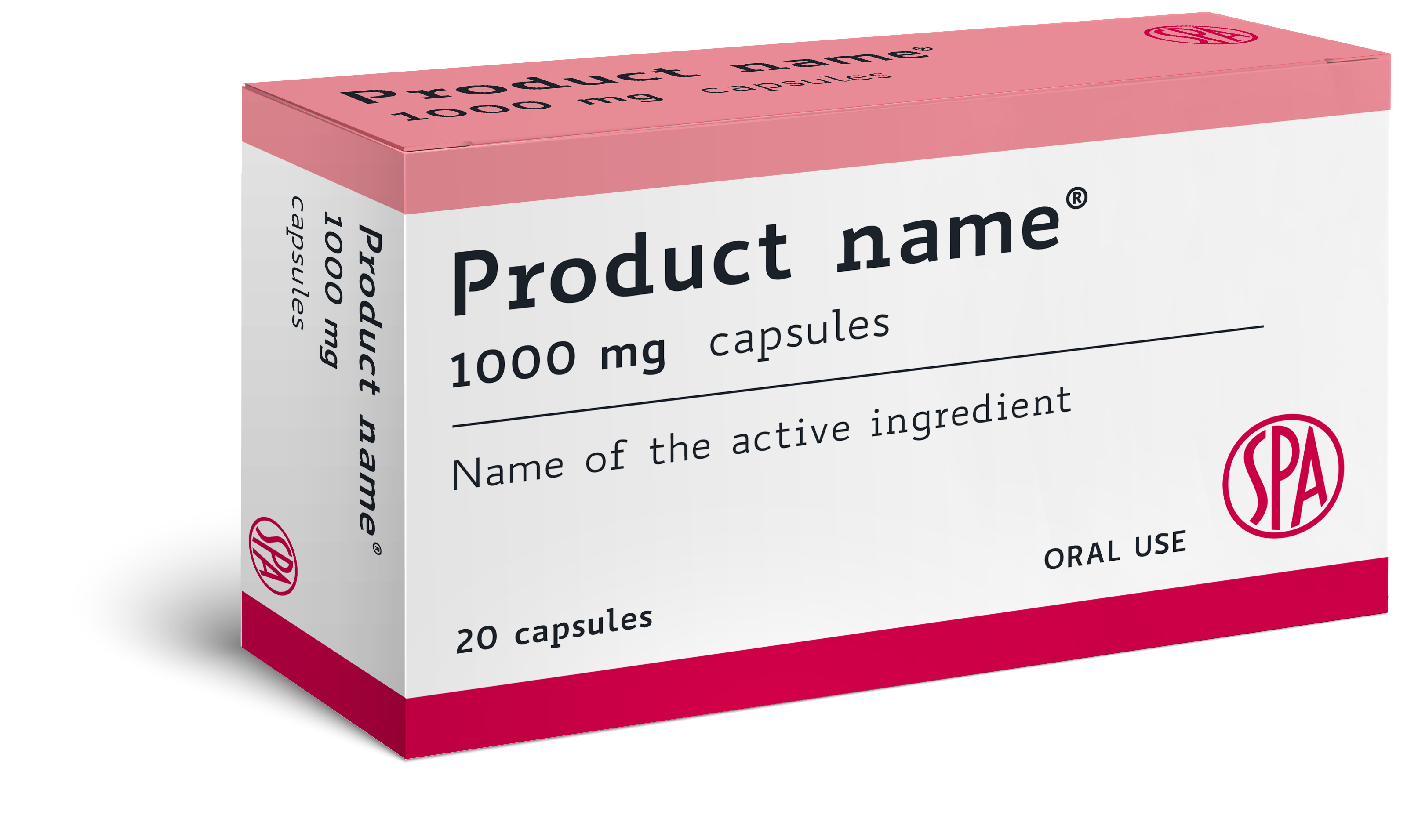
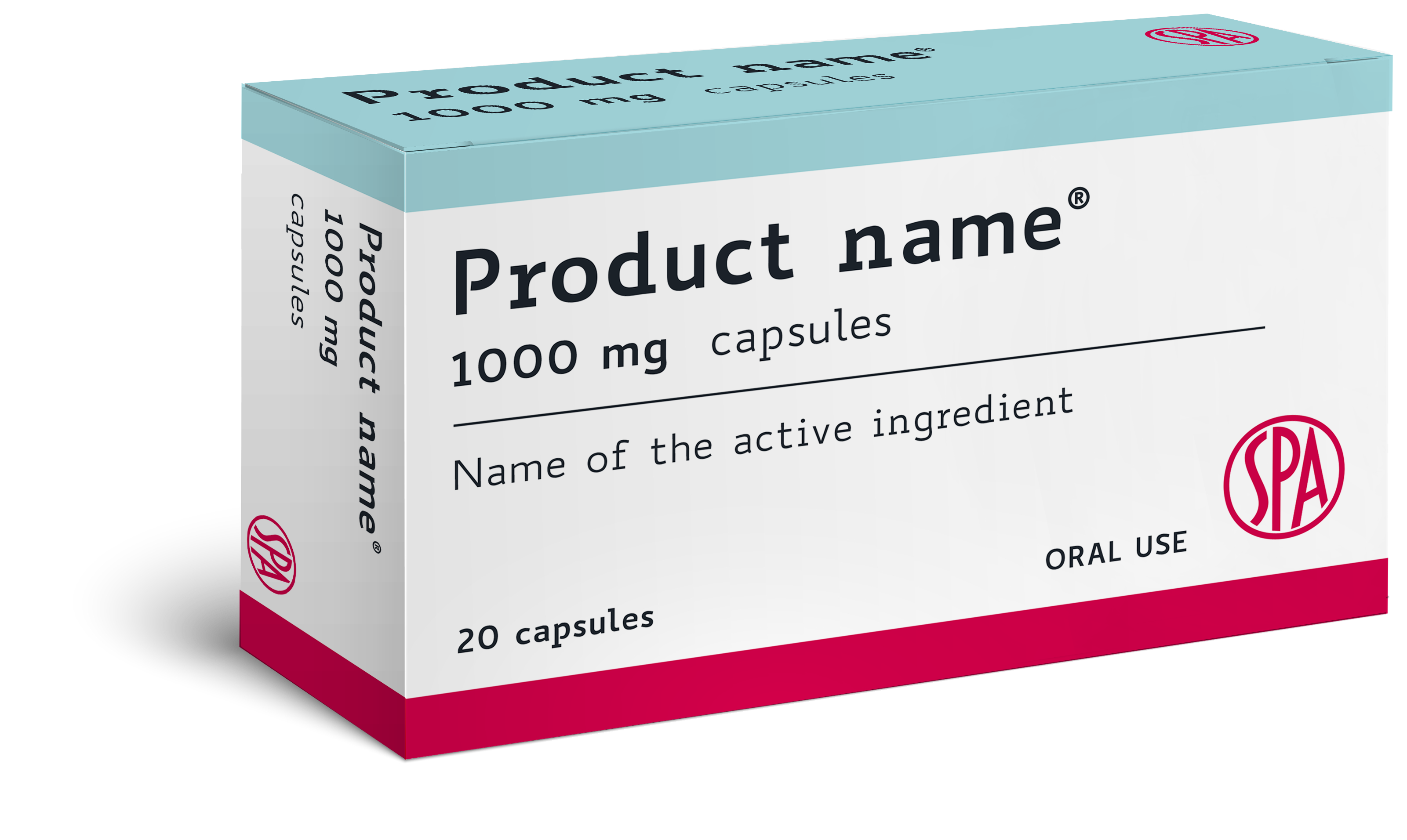
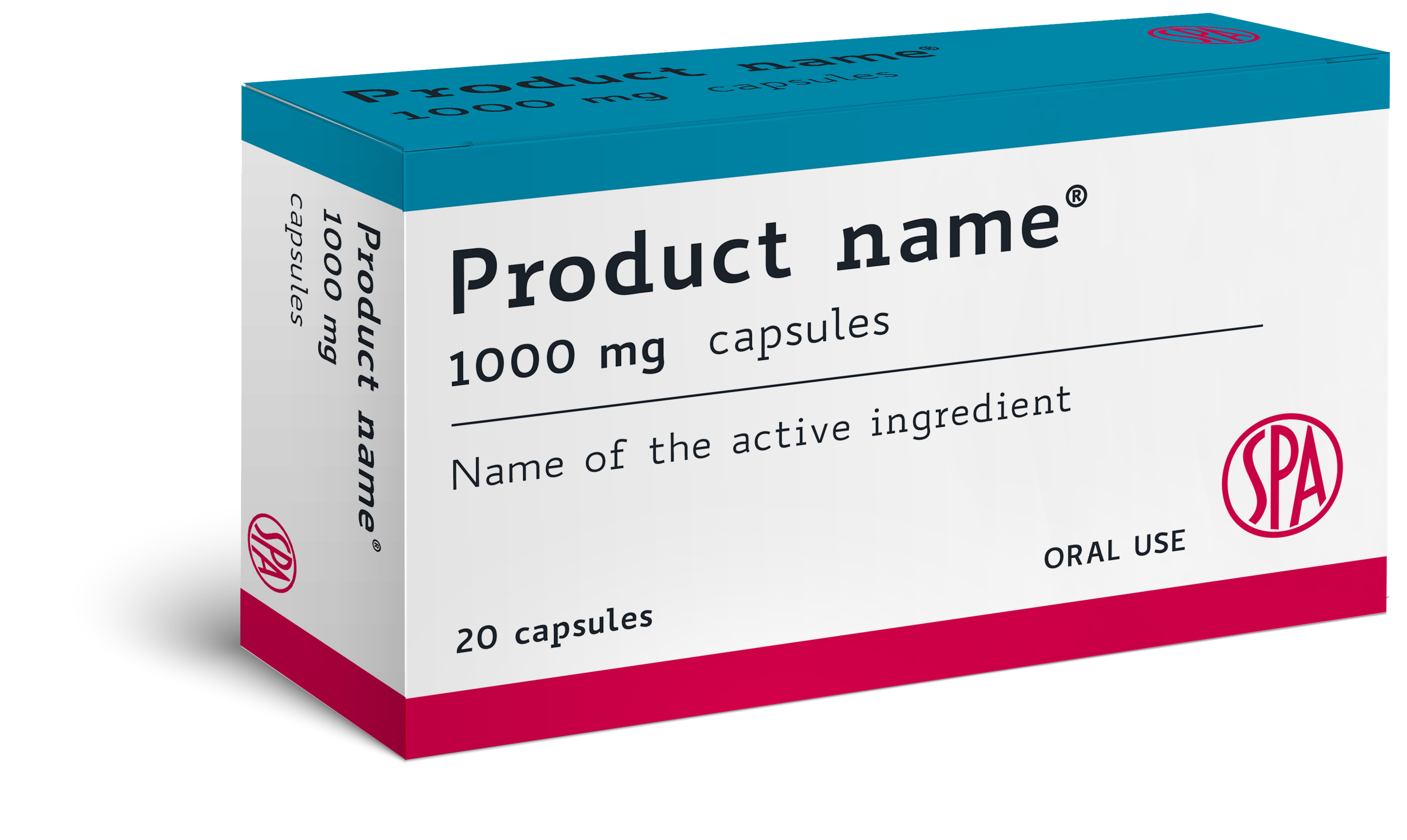
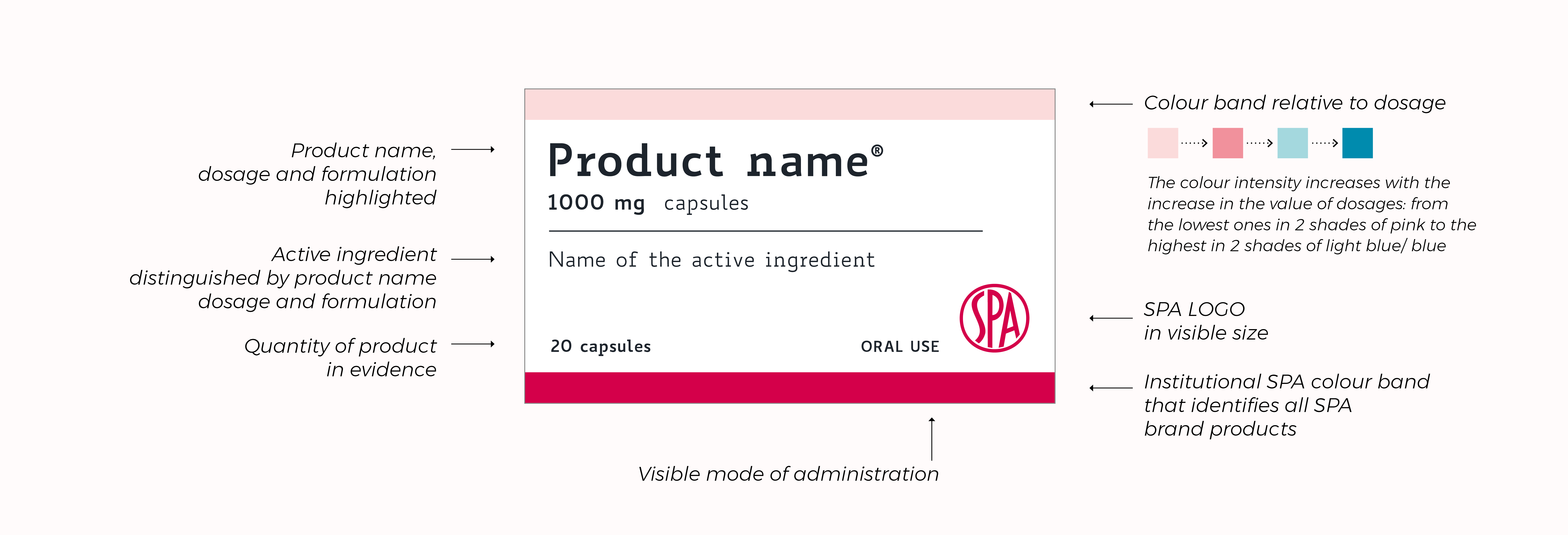
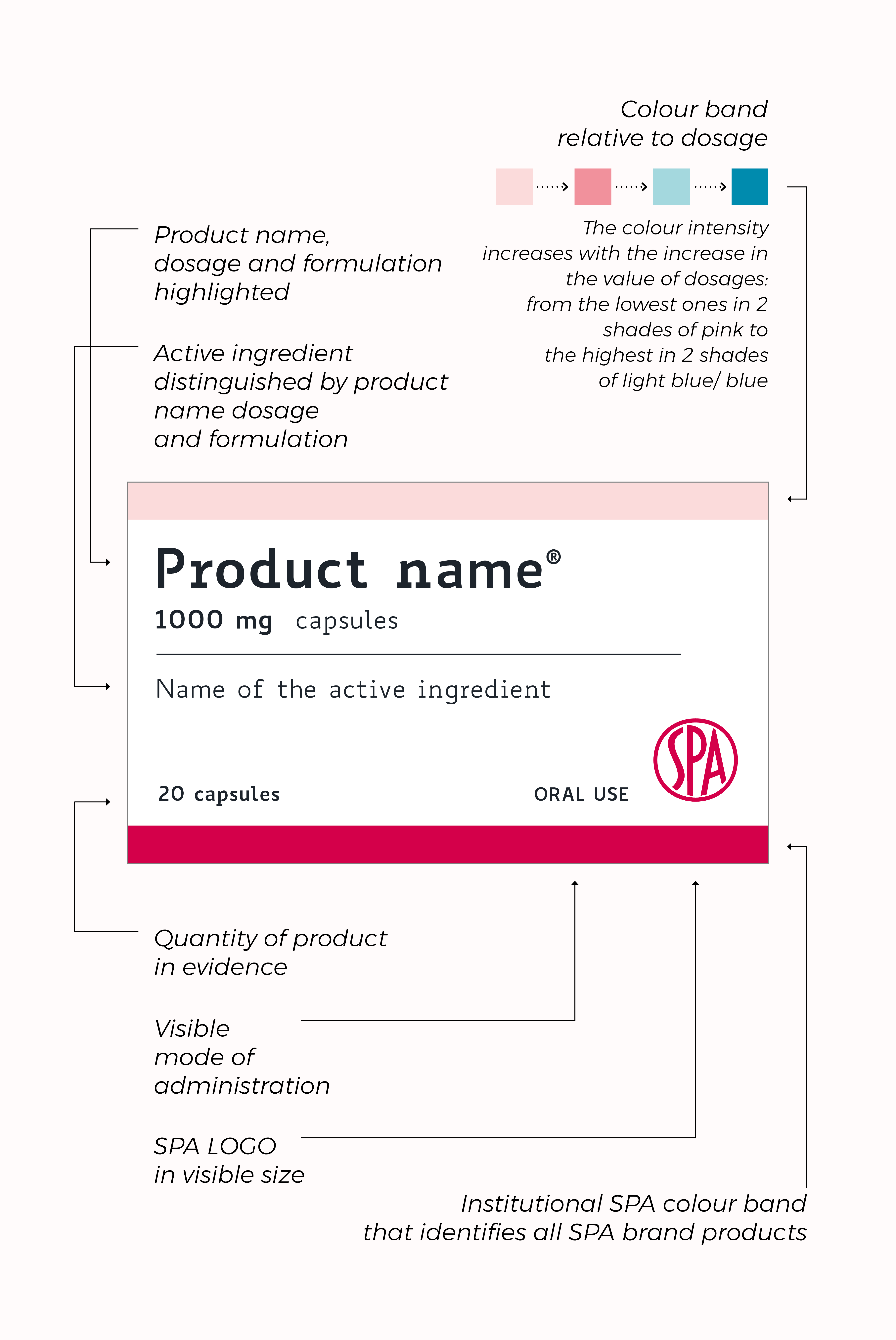
New graphic style, new colour code, new typeface BIANCOENERO® higher readability, concevied for people with dyslexia. The packages of SPA drugs have been redesigned to make every information usable in an optimal way, especially for fragile patients, elderly, with vision-related disorders and reading difficulties.
-
Benefits for the patient
The packaging is key for the patient, because it allows them to manage their therapy correctly.
An adequate graphic design allows to identify, require and take the drug correctly, combining the aesthetic appearance with a clear and legible communication of the fundamental information related to the product, especially when therapy requires management of several packages and multiple dosages.
-
Benefits for the doctor
To complement the role of doctors prescribing therapy, SPA has chosen to enhance and optimize the real function of packaging.
-
Advantages for the pharmacist
Today pharmacists must have the most effective and clear tools for their activity of guidance and support therapy.
Pharmacies represent in fact a reference garrison regarding the access to the drug, from the request for information, to the indications on the assumption and the clarifications on the effects.
The study of recognizable packaging, easy to read and quick distinction. Finally, it is particularly valid during the operations of logistical allocation in the pharmacy warehouse and of immediate and evident identification of the drug in the service and consultancy.
-
Goal
We mean to offer everyone autonomy and safety in the management of drug, ensuring and simplifying adherence to therapy through:
– high legibility, high accessibility
– maximum clarity of information (name/active ingredient, dosage/formulation)
– excellent identification and recognition
New graphic style for class A drugs
A new step forward in the relationship between drug and patient
SPA has always considered evolution as a progressive improvement in every aspect of access to therapy, always under the banner of “taking care”.
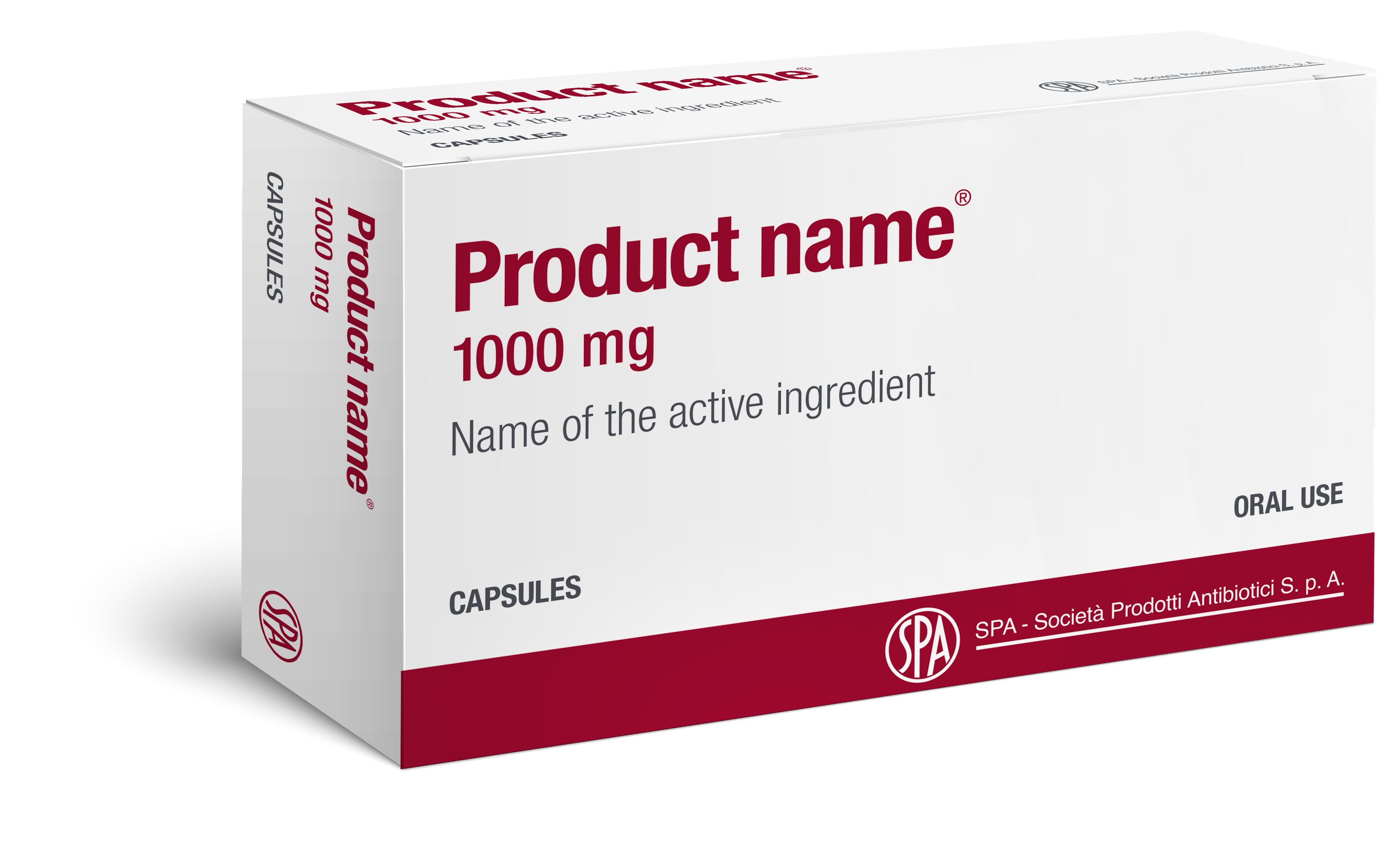
Historical packaging

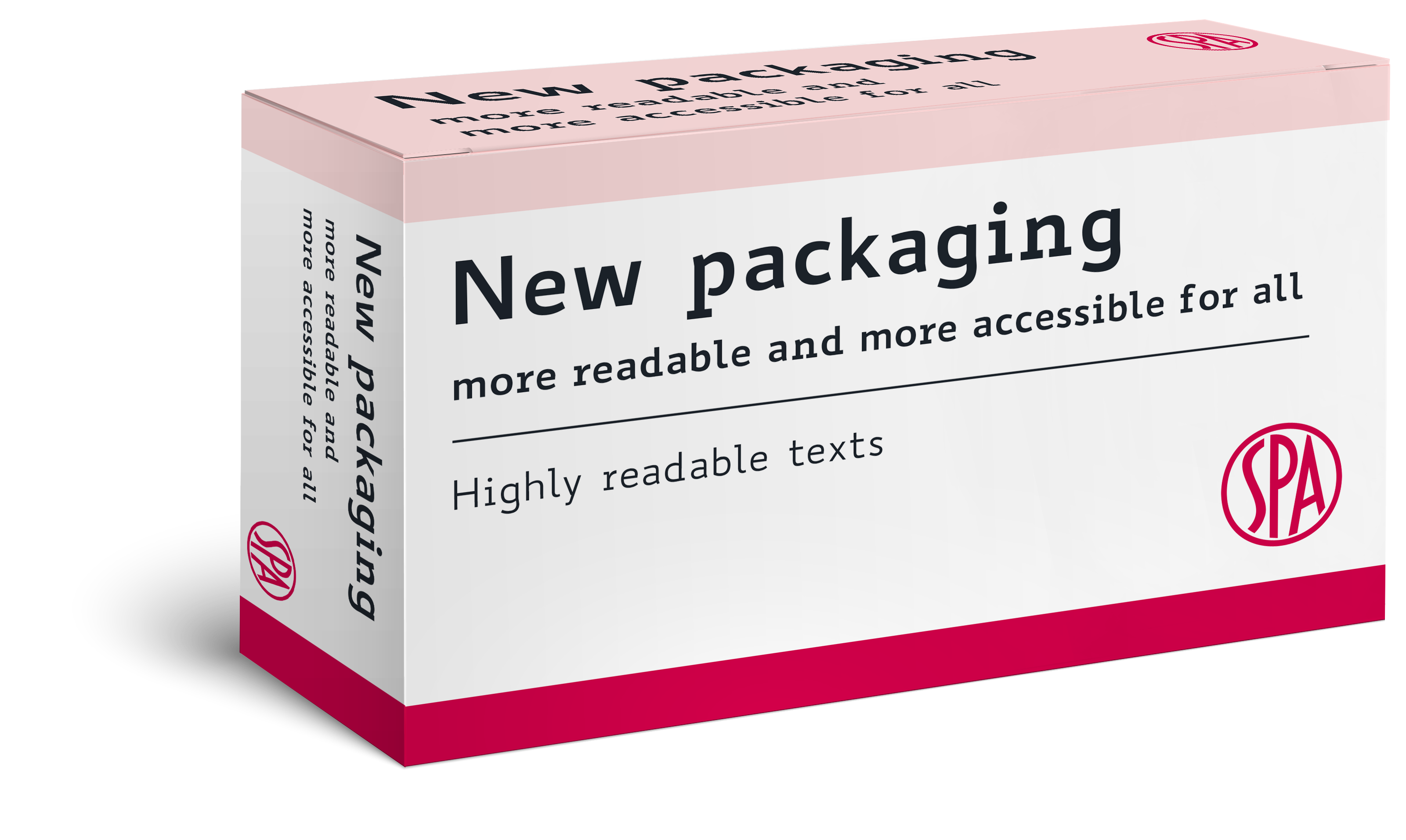
New packaging 2021
The font is available free of charge for non-commercial users.
For info and insights: http://www.biancoeneroedizioni.it/