Brand-new higher readability packaging, more accessible for everyone.
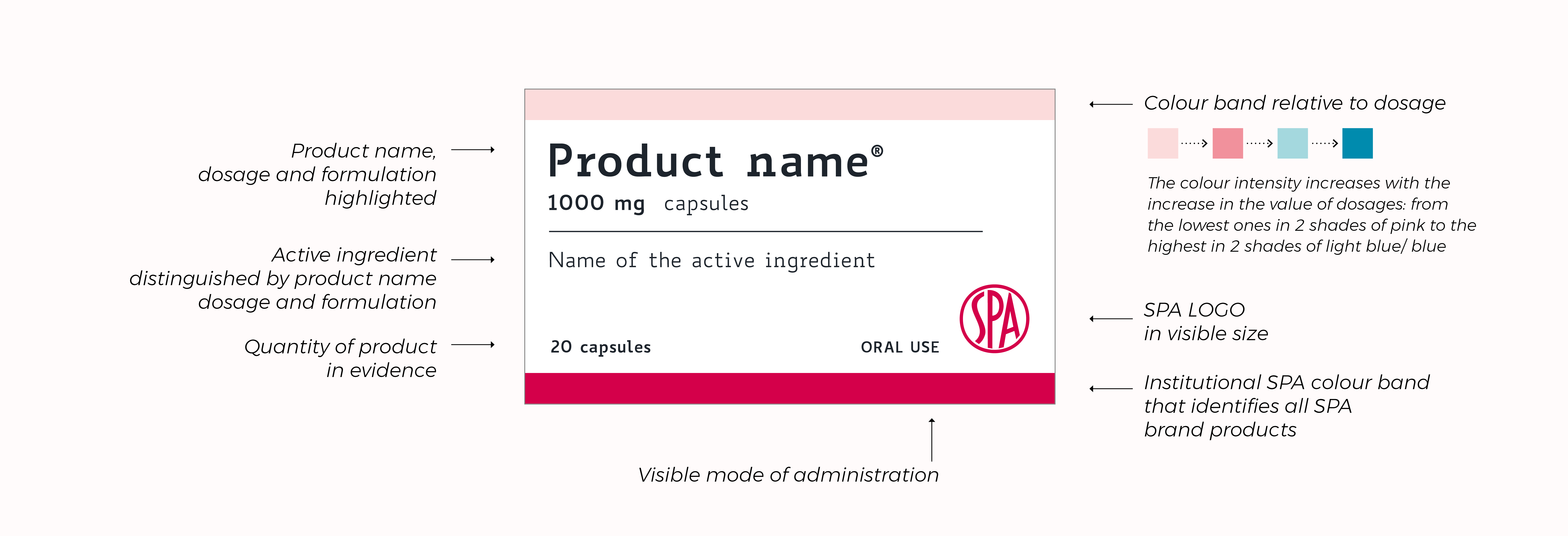
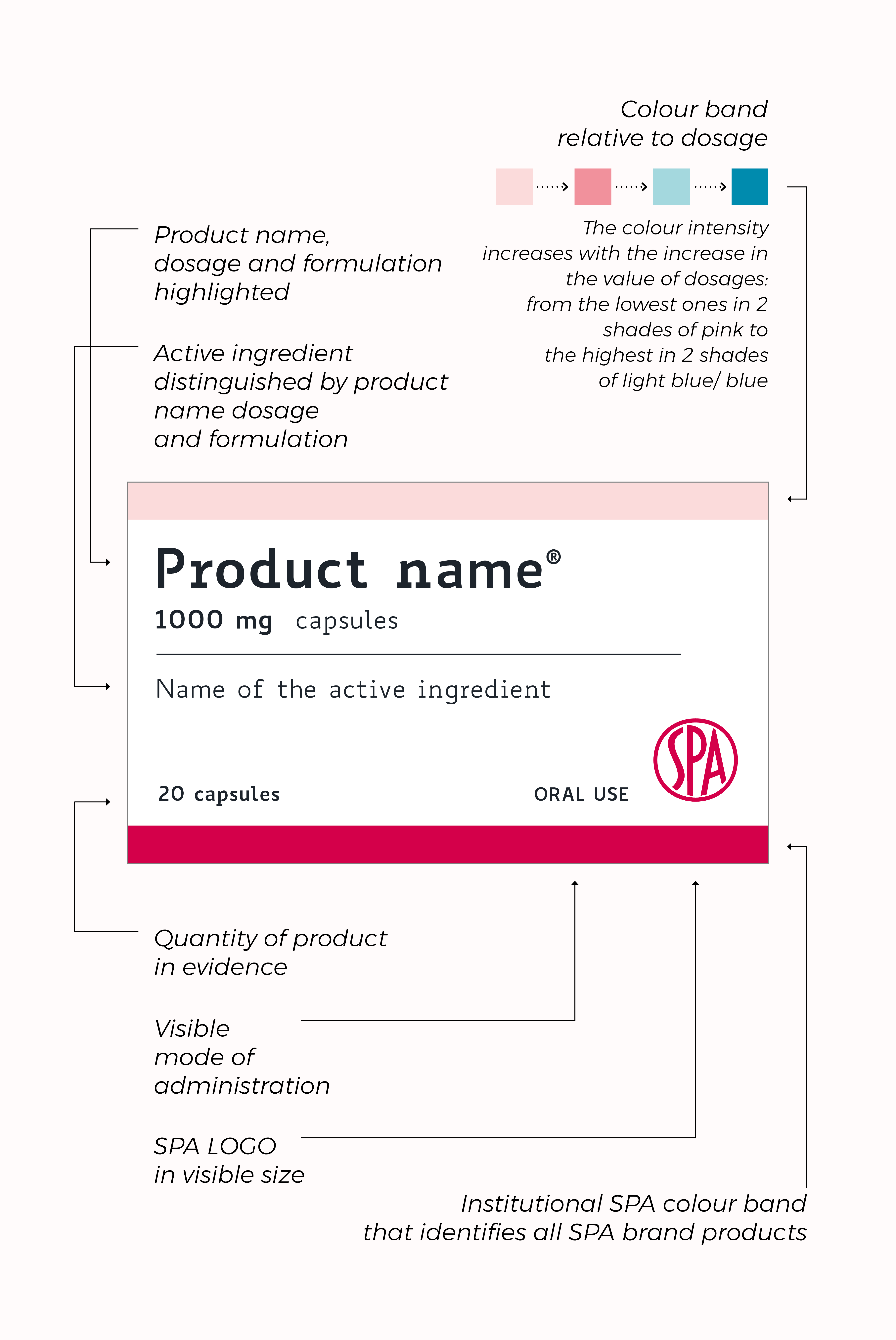
- High readability Biancoenero® type.
- Clear and quick reading of all the main information on the 3 sides of the package.
- Precise indication of the dosage, which follows the name of the drug in legible size.
- Identification color for the different dosages clearly visible. (upper front fascia, upper facade, side facades) and with intensity that grows with the increase in dosage, to facilitate the recognition by the doctor, pharmacist and consumer.
- Institutional chromatic identity with lower front band in the institutional red SPA.
- Graphic elements reduced to the essentials, with large white backgrounds to allow a clear and agile reading.