
A higher degree of readability and accessibility.
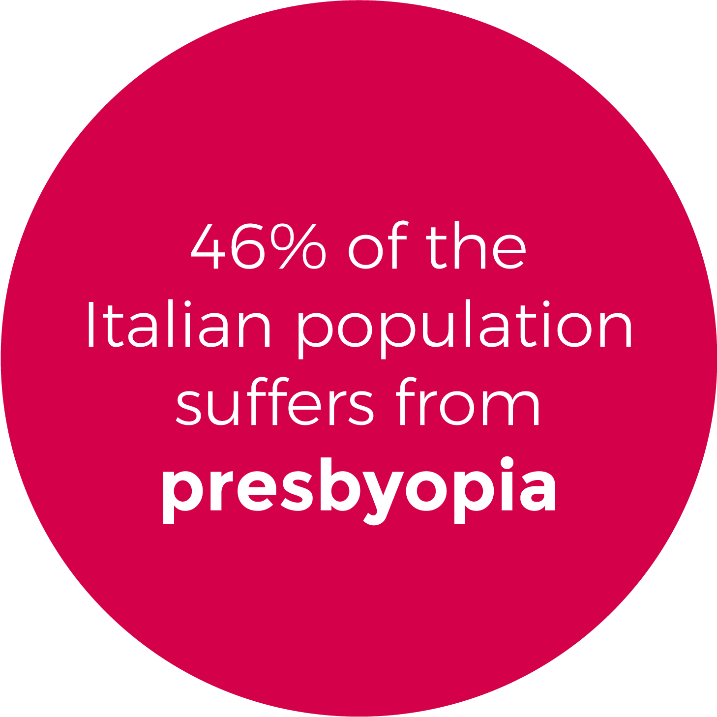
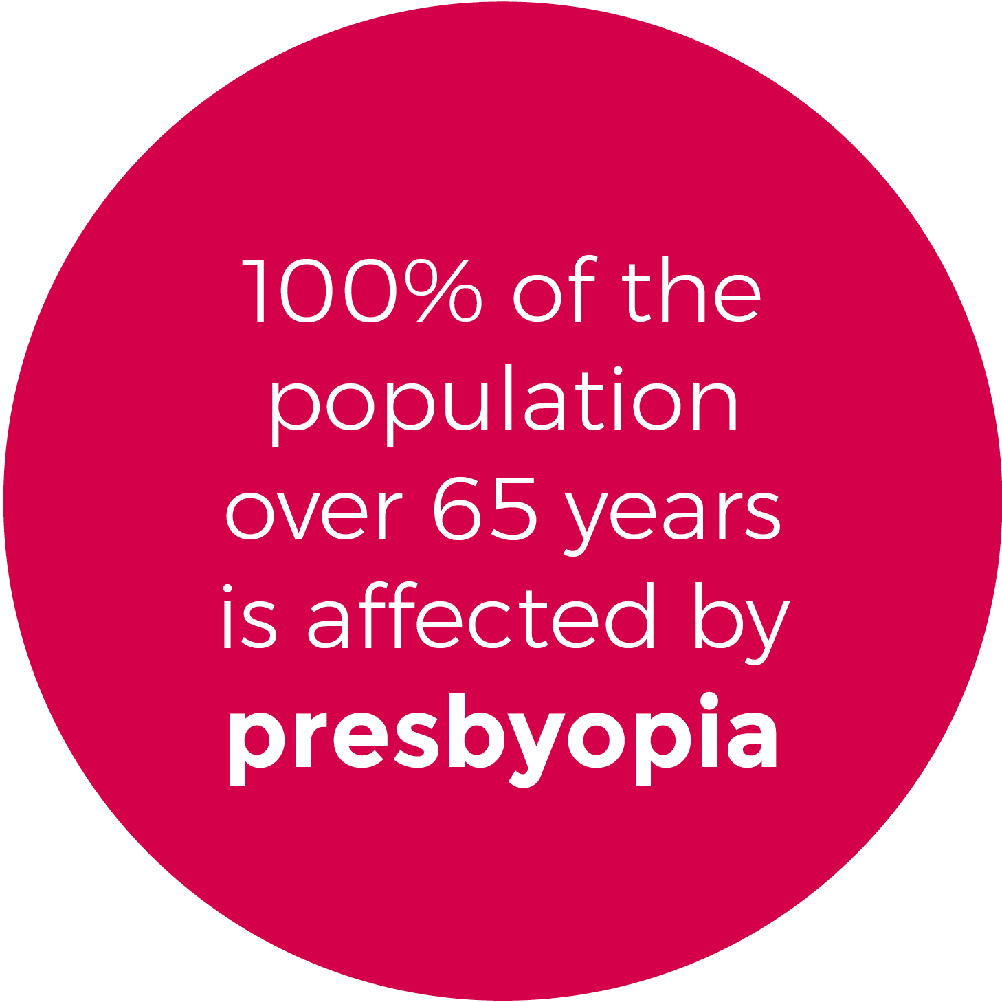
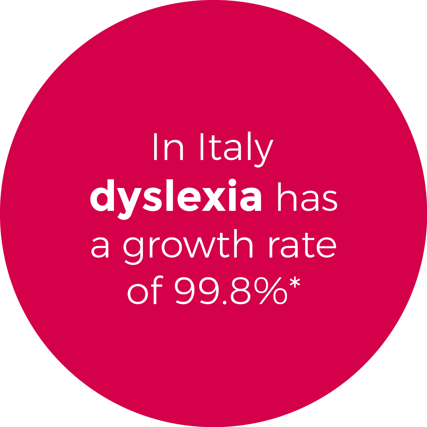
SPA has officially adopted BIANCOENERO®, a typeface intended and designed to make the text optimally usable, especially in the event of dyslexia and presbyopia.
This choice responds to the desire to take a further step of evolution in the relationship between drug and patient, under the banner of greater social responsibility as sustainable development, from generation to generation. Greater clarity, maximum readability and consistent confidence.
This is what it means for SPA to "take care" of all aspects of access to therapy, from the reduction of impediments to the understanding and storage of essential information of the drug to the improvement of therapeutic adhesion.
The packaging of the drug plays a fundamental role in making the product immediately recognizable and communicating its properties, distinguishing it from other drugs.
We remind you that since October 1997, the texts and colors of the pharmaceutical packaging have been accompanied by indications in Braille code for non sellers.
In this vein, today SPA wants to enhance as much as possible the real function of pharmaceutical packaging, combining the aesthetic aspect with a clear and legible communication of the fundamental information related to the product, especially towards those who have reading difficulties.
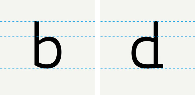
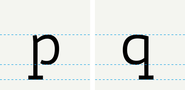
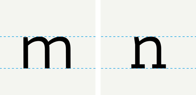
Structural details of the typeface BIANCOENERO® compared to the other characters:
-
measures to increase the distinction between mirror letters
Click or tap on the image to see the animation.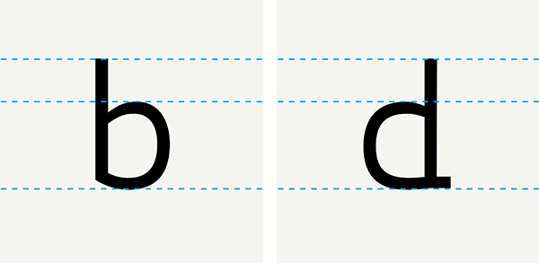
Click or tap on the image to see the animation.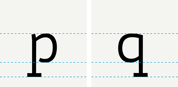
-
measures to increase the distinction between similar letters
Click or tap on the image to see the animation.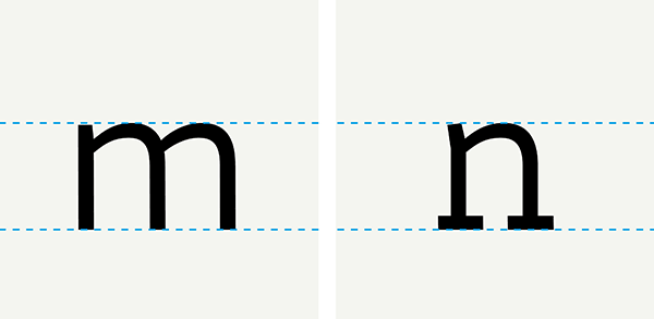
Click or tap on the image to see the animation.

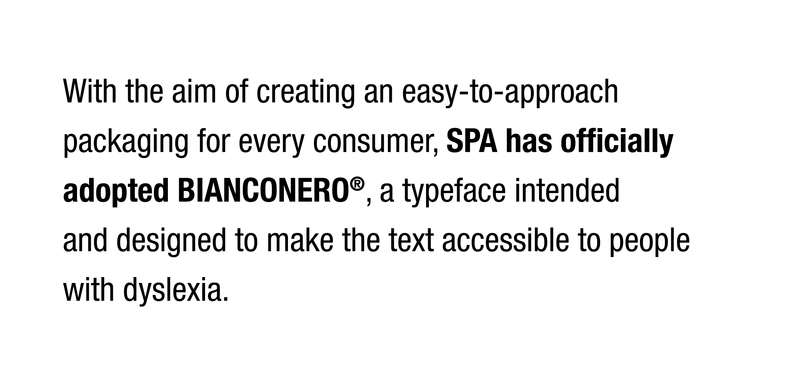
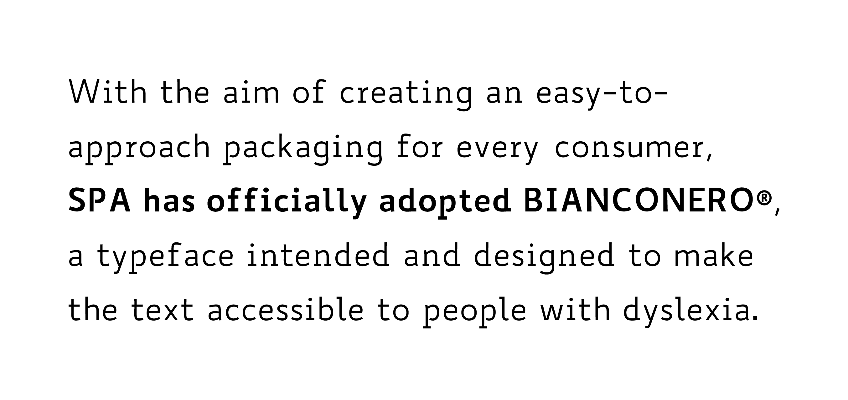
Example of greater readability of the font WHITE or BLACK than a standard typeface:


BIANCOENERO® is designed by Umberto Mischi for BIANCOENERO EDIZIONI, with the advice of Alessandra Finzi (cognitive psychologist), Daniele Zanoni (expert in methods of study in learning disorders) and Luciano Perondi (designer and lecturer in typography at ISIA in Urbino).
For info and insights: http://www.biancoeneroedizioni.it/